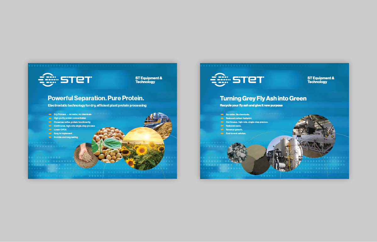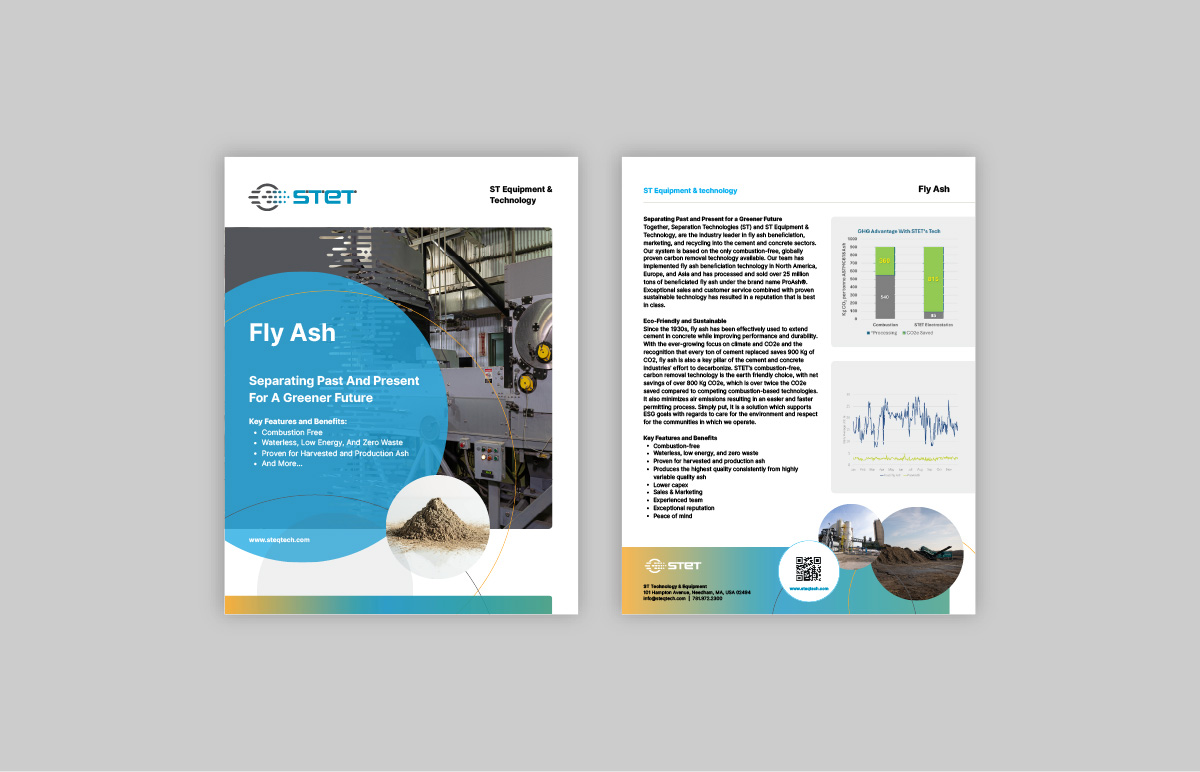
STET is recognized for transforming processing with their innovative, electrostatic technology. Designed to elevate efficiency, enhance product quality and support sustainable practices, the electrostatic separators are recognized for adapting to a wide range of materials and applications.
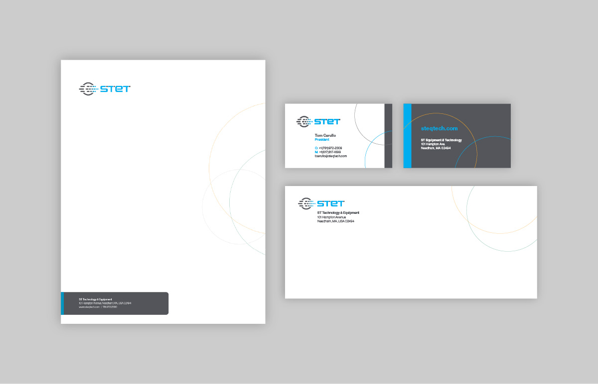
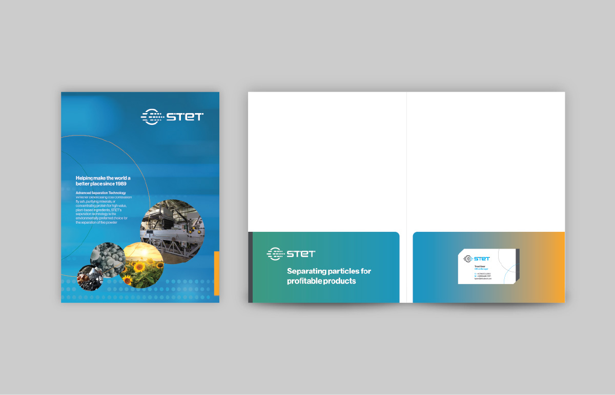
we developed STET's corporate identity with a clean, modern aesthetic that reflects the brand’s innovative approach to separation solutions. A key design feature is the use of overlapping circles, which visually represent the element separation process central to STET’s core technology. These circular forms appear throughout the identity system, and graphics, reinforcing both the brand identity and the science behind the work.
Info
-
ClientST Equipment & Technology
-
Year2025
-
RoleLogo / Collateral / Corporate Identity / Web design & Programming
-
Website
-
Partner
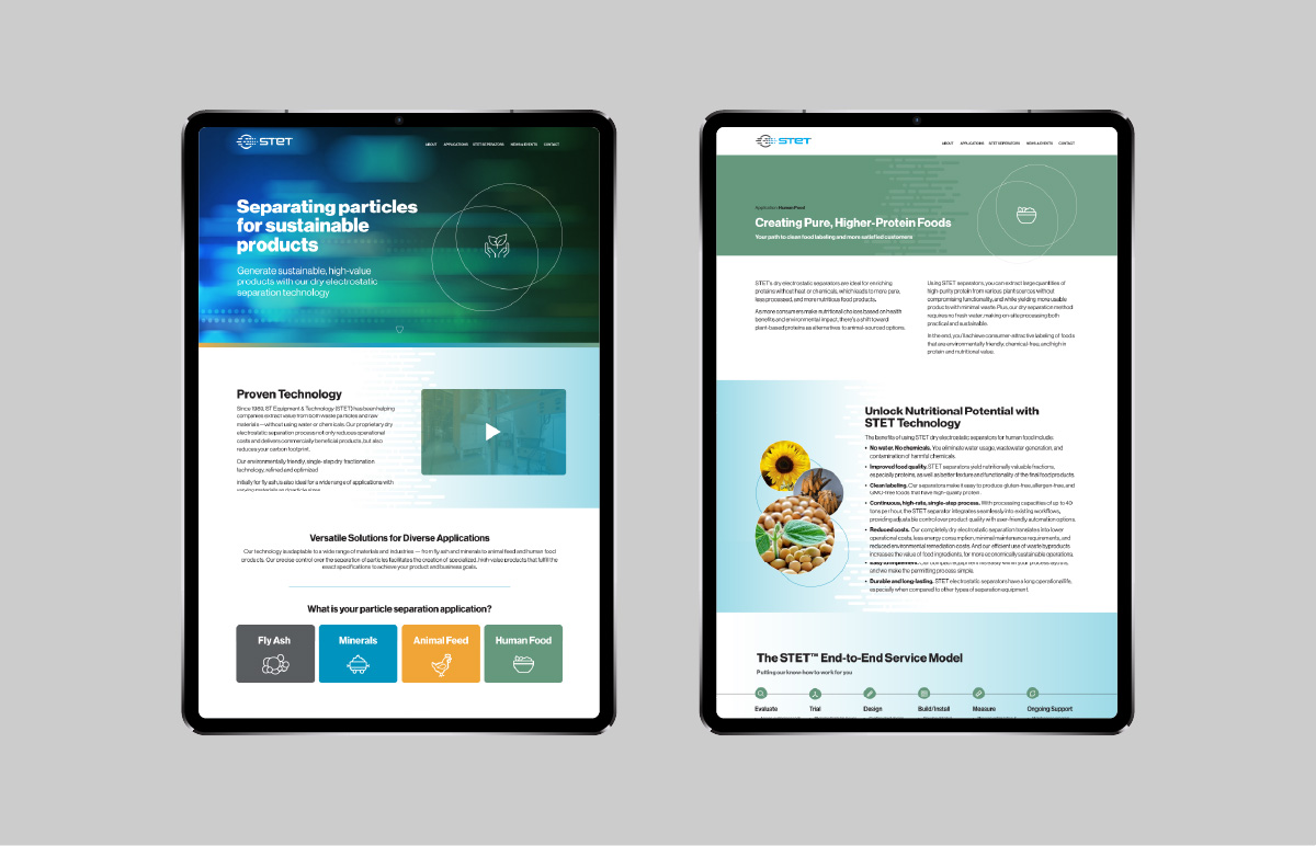
The cool, tech-forward color palette of blues and teals adds a sense of trust and clarity, while subtle gradients and shadows bring dimension without distracting from the content. The layouts are structured yet spacious, ensuring a smooth, intuitive user experience that feels both sophisticated and approachable.


